Role: UI/UX Intern
Timeline: Sept 2023 - July 2024
Team: 2 UI/UX Interns, 1 PM
Background
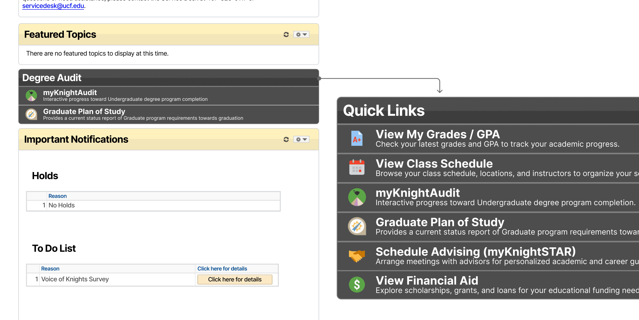
Facing usability issues in UCF’s myUCF student portal, I proposed improvements during a User-Centered Design course in Spring 2023. The project quickly gained attention, leading to an internship with UCF IT, where, along with two other interns, I conducted user research and designed solutions that resulted in several improvements to the current portal. By the end of the project, navigation steps to access GPA were reduced by 60%, and students’ most requested resources were made more accessible via a new Quick Links module.
My responsibilities during this internship included (but was not limited to): leading user research and data analysis, drafting technical documentation, briefing stakeholders, presenting to various UCF departments, and designing high-fidelity prototypes.
The Problem
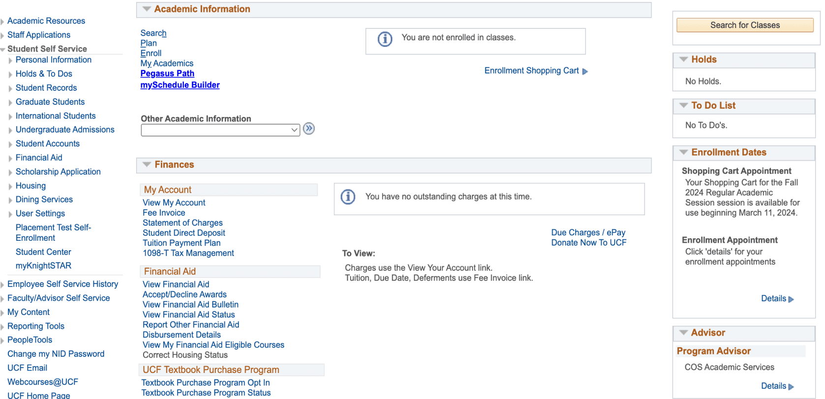
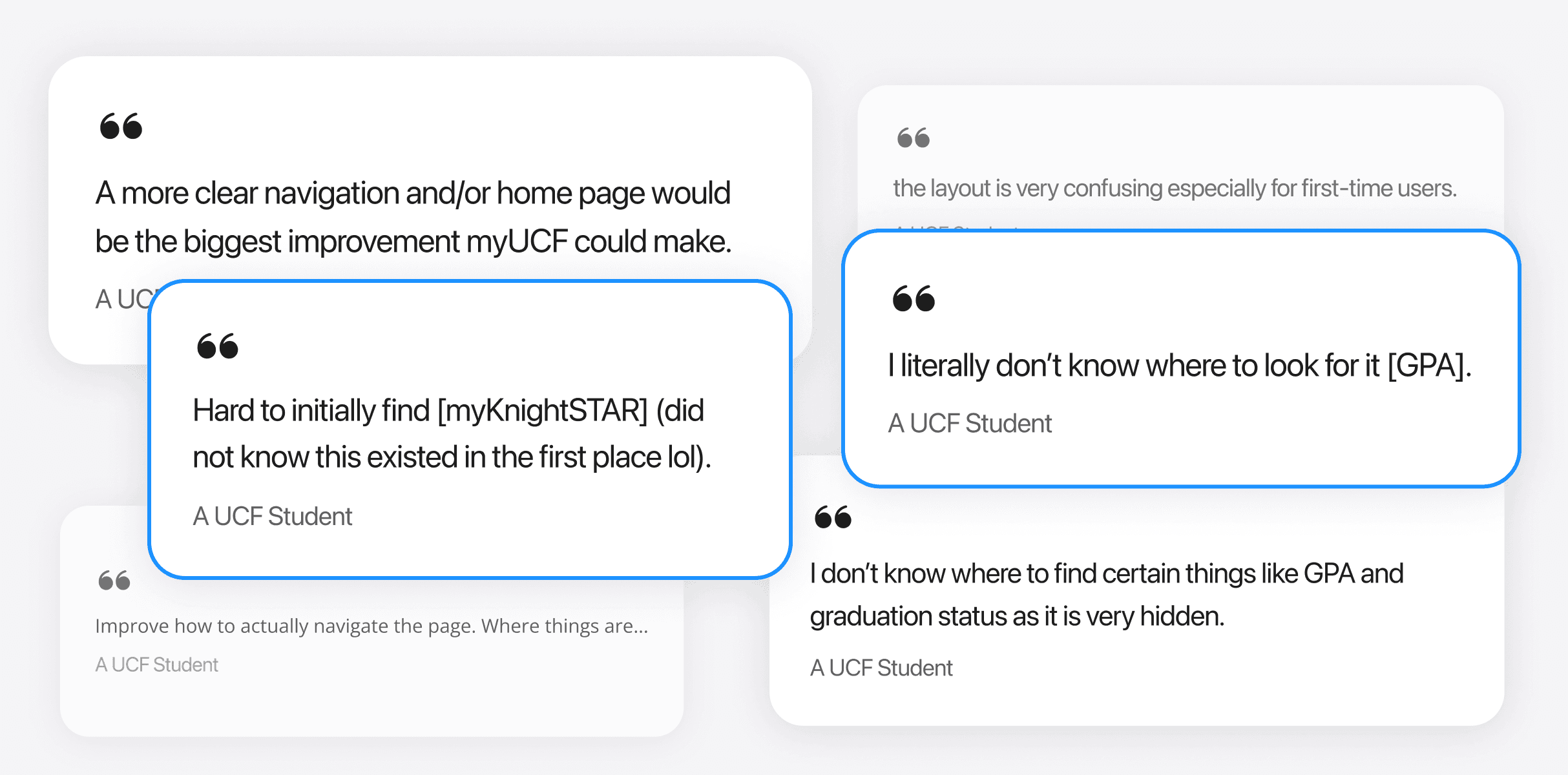
The myUCF portal faced numerous usability issues, including confusing navigation, overwhelming drop-down menus, and difficulty accessing essential information like GPA.
Outdated & Non-Responsive UI
Confusing & Excessive Navigation
Approach
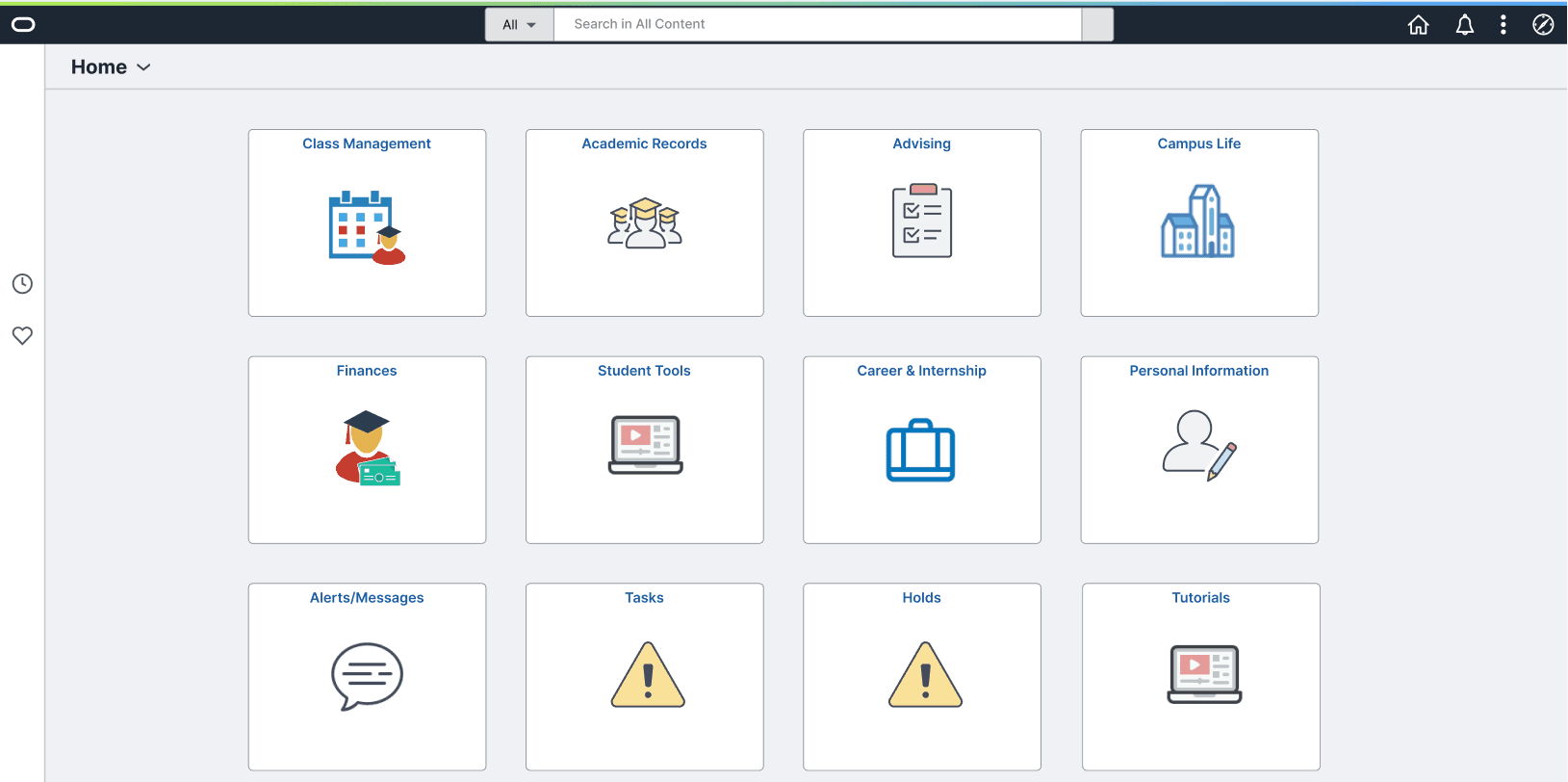
The project began with the transition into the Enterprise Applications (EA) department within UCF IT. The initial focus was to research the technologies underpinning the myUCF portal, namely Oracle’s PeopleSoft Campus Solutions with its "Classic" interface. There was internal interest, however, to move towards "Fluid", a newer PeopleSoft interface, with responsive and modern capabilities.
The project’s scope focused on researching and designing for Fluid. The challenge, however, was addressing the needs of current users since Fluid was unlikely to be implemented soon. This required us to strike a balance between enhancing the existing "Classic" interface and progressing with the research and design of the Fluid interface, ensuring that both priorities were effectively managed.
Solution
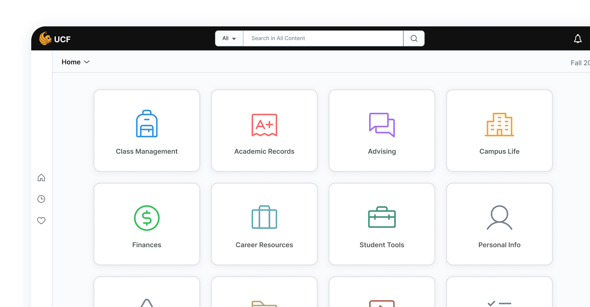
There were four primary areas addressed within the scope of this project. Although there were many other items that could be improved, based on our timeline and limitations, these fell within the intersection of being the most impactful and most feasible for the end users and stakeholders. Note: (Classic) refers to refinements made to the current myUCF portal, (Fluid) refers to those made to a proposed portal interface.
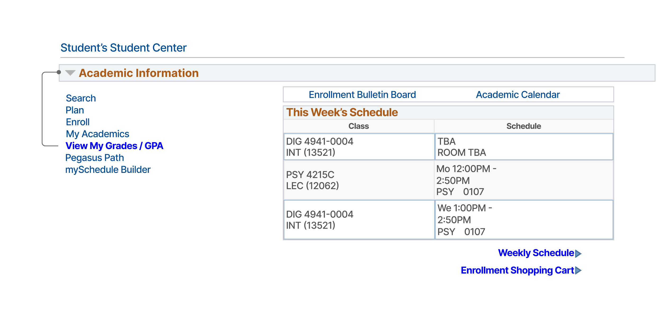
Navigation Shortcuts (Classic)
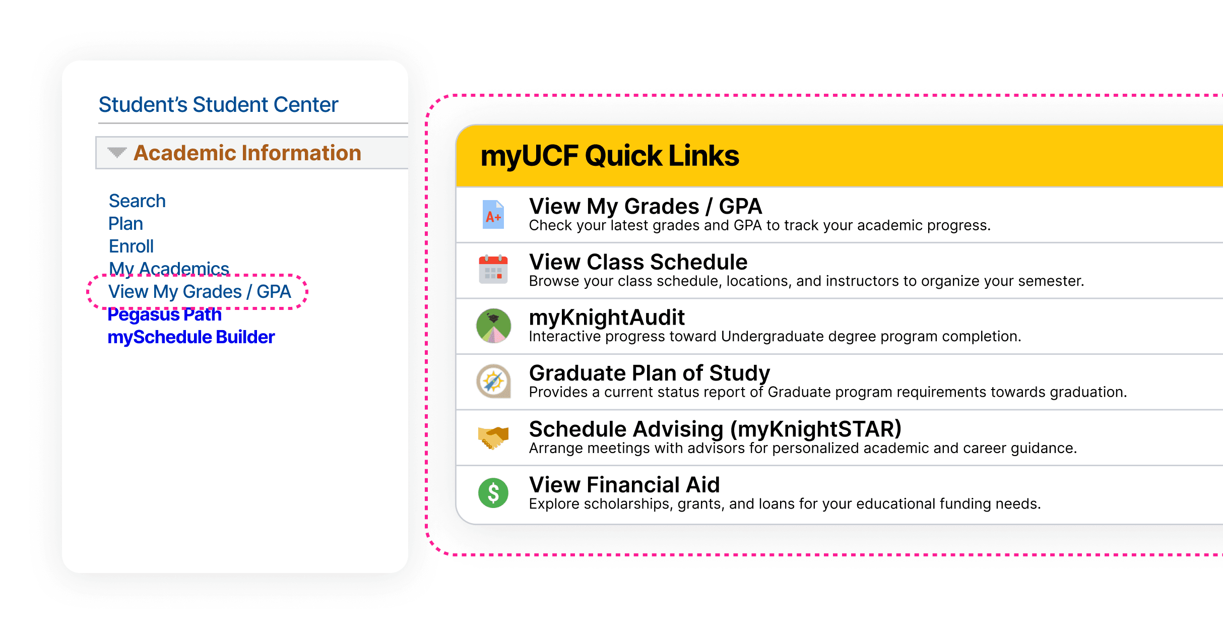
Reduced ‘GPA’ navigation steps by 60% (from 5 to 2 clicks).
Provided quick access to the top 5 requested resources via a Quick Links module.
Updated Information Architecture
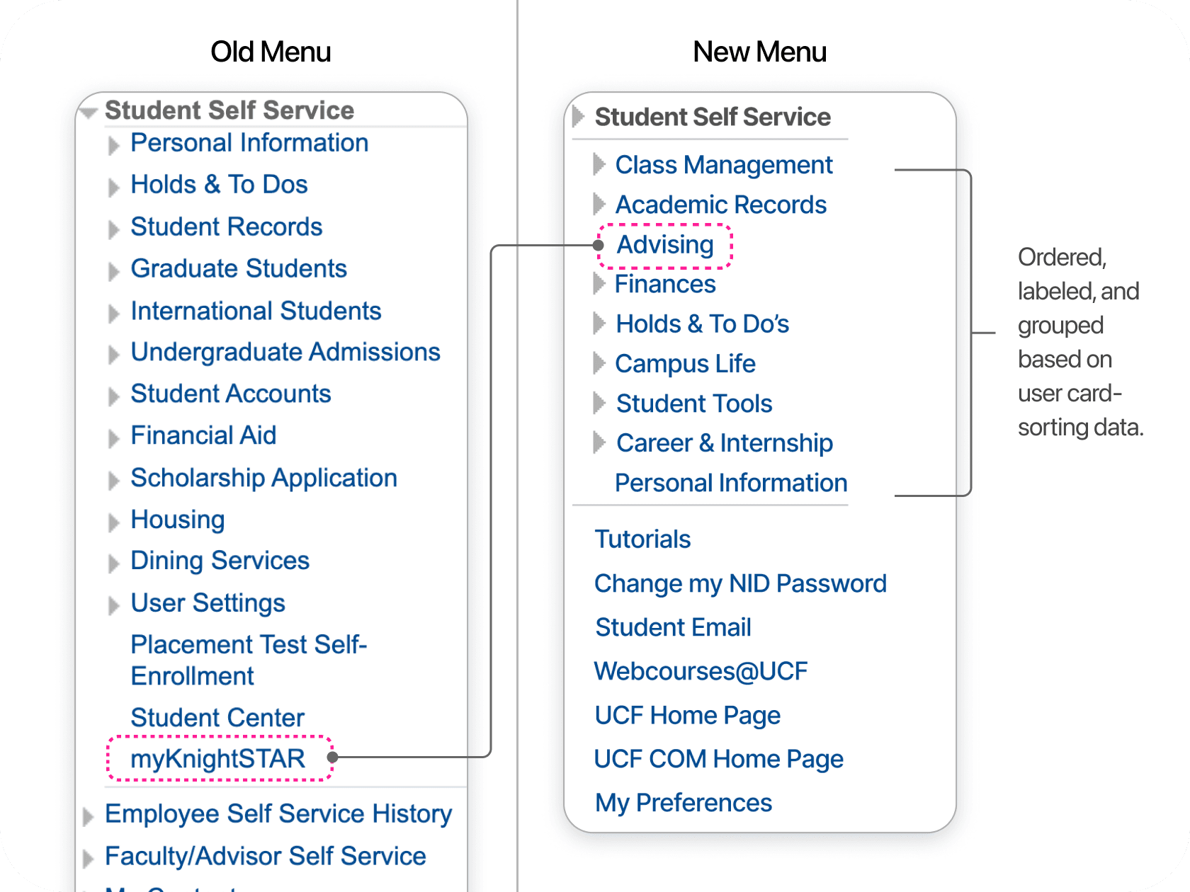
Arranged categorizes to better reflect student's cognitive groupings.
Renamed "myKnightSTAR" to "Advising", improving term clarity.
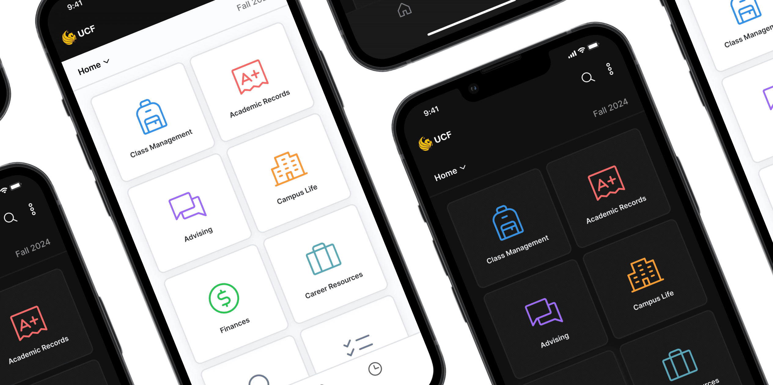
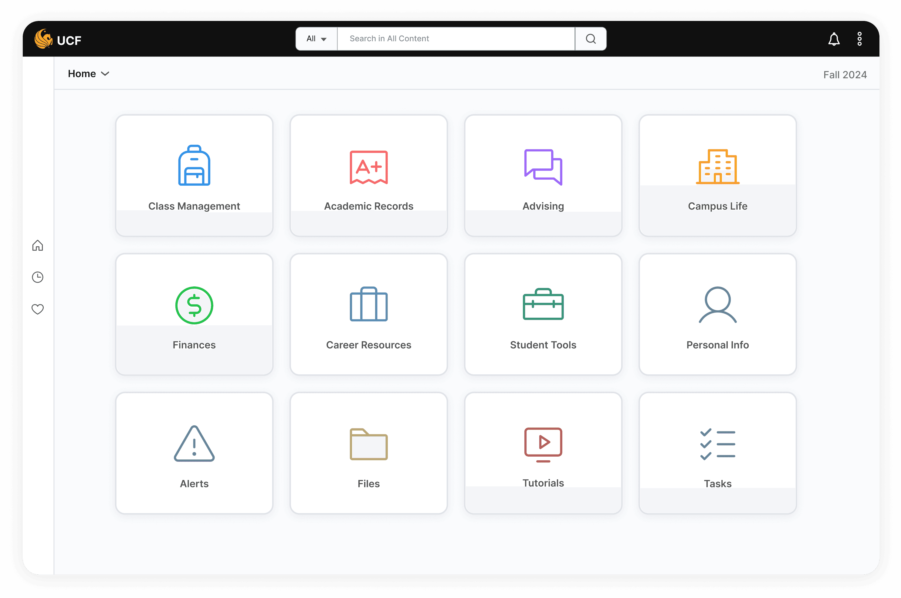
Fresh & Responsive (Fluid)
Improved interface aesthetics with a modular and modern Fluid theme.
Designed for mobile accessibility and responsiveness.
Paving the Way for Future Development
Obtained essential funding to propel the R&D of the PeopleSoft Fluid interface.
Inspired the hiring of 10 interns, ensuring long-term project support.
Research
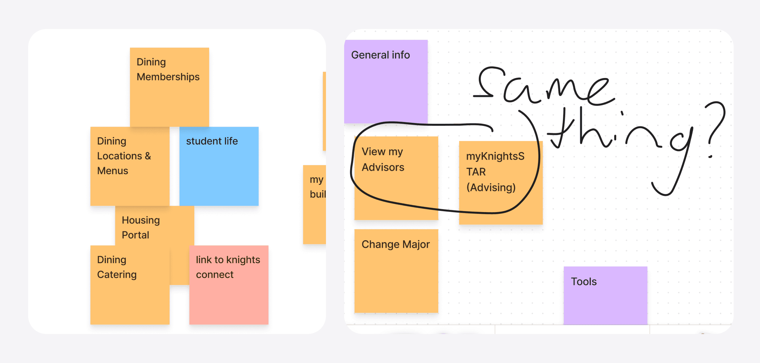
The research methods employed were surveys, interviews, card-sorting sessions, and product research. We gathered insights from over 123 students, uncovering key pain points such as confusing menu structures, excessive drop-down links, and the need for mobile optimization.
Qualitative Highlights
Quantitative Highlights
47% (of 123) survey respondents struggled to find their GPA and wanted faster access.
The label "MyKnightSTAR" (the primary advising tool) was unclear to nearly half (7/15) of card-sorting participants.
93% (of 123) survey respondents primarily access myUCF on their Desktop.
21 survey comments regarded challenges with navigation.
4 out of 6 interview participants noted difficulties in navigating the portal due to the menu layout.
Out of 15 card-sorting participants, an average of 8 categories were formed. (Previously, the portal had 14 menu categories).
The data collected from user research informed the current portal UX by prioritizing GPA information and improving general navigation. For the Fluid portal, feedback highlighted the need for better mobile support, layout enhancements, and improved accessibility, reinforcing the business interest in Fluid.
Design Process
After gathering and synthesizing the research, my team met with the engineering leads to discuss our findings. Given the constraints of time and feasibility, we decided to implement a GPA link under the academic information section and repurpose the Degree Audit section into a general "Quick Links" module to streamline access.
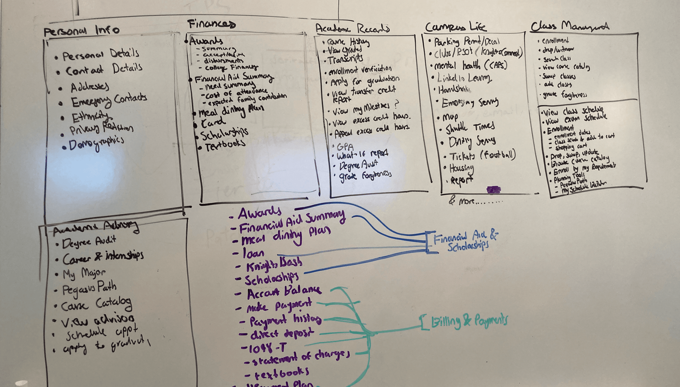
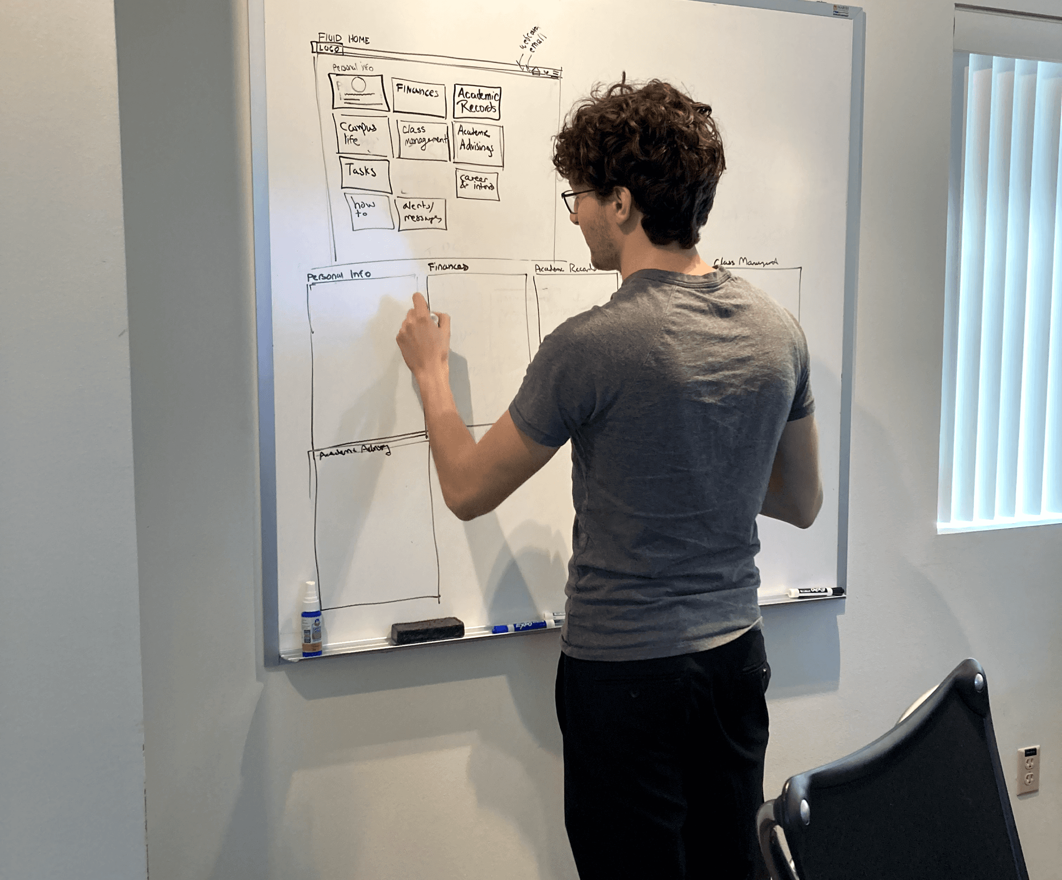
Afterwards, I began structuring the information architecture by drafting page content and organizing it according to user feedback. This process was designed to inform both the current myUCF portal menu and the Fluid interface prototype.
Final Designs
Reflection
This project provided a profound learning experience in applying UX strategies within a traditionally non-UX focused environment. One key takeaway was the importance of initial research and early engagement with the right stakeholders. By asking the right questions and involving key individuals from the beginning, we could have navigated the project more effectively and avoided certain roadblocks. Another valuable lesson was learning to accept the limitations and timelines of the project. While there were many challenges I wanted to address, I had to prioritize and focus on what was achievable within the scope, understanding that not every problem could be fully resolved within the given constraints.
